Business challenge
Merchants on WooCommerce lacked an intuitive way to discover, configure, and manage third-party payment methods. This not only made it harder for merchants to experiment with and adopt the best-fit options for their stores. The inconsistent display of payment options negatively impacted trust and conversion. The challenge was to redesign WooPayments settings to empower merchants with flexible control, improve discoverability, and create a more polished, trustworthy payment experience for end customers.
Objective
Redesign the WooPayments settings to streamline how merchants discover, activate, and manage multiple payment methods. Enabling flexibility to test what works best, while ensuring a clean, trustworthy checkout experience for customers.
Questions
- How might we make it easier for merchants to discover, activate, and reduce friction in managing multiple third-party payment providers?
- What tools could help merchants experiment with multiple payment options to see what works best for their customers?
- How might we ensure that the way payment methods are displayed to customers builds trust and encourages conversion?
Identify the problem
As part of the design process, I used 5 Whys method to uncover the root causes behind the lack an intuitive experience for discovering, configuring, and managing third-party payment methods. As well as the inconsistent display of payment options that can affect customer trust.
- Why are merchants struggling to manage and display multiple payment options effectively?
The current settings are cluttered, lack clarity, and aren’t optimized for handling multiple payment options (Google Pay, Apple Pay, Link, PayPal, and Amazon Pay). - Why are the payment settings cluttered and unclear?
Based on the qualitative interviews with 20 merchants, many found it frustrating to navigate between separate settings across different third-party plugins. They also noted that inconsistent and cluttered payment button appearances on their WooCommerce stores negatively impacted both customer trust and sales. - Why is there separate settings across different third-party payment plugins and inconsistent button appearance?
The primary focus was on enabling payment functionality rather than optimizing the merchant experience in managing or presenting these options. Additionally, each third-party payment has their own unique standard of payment buttons and configurations, leading to inconsistencies across the storefront.
How to approach
- How might we streamline the experience for merchants discover, configure, and manage multiple payment options?
- How might we reduce friction by unifying settings across different payment providers into a more intuitive and centralized interface?
- How might we standardize the display of payment buttons to build customer trust and improve visual consistency across storefronts?
Data and Gap analysis
I conducted user testing and a gap analysis to evaluate the existing payment settings and payment button appearances across WooPayments and third-party providers to identify key areas for improvement:

- Poor discoverability
The Payment section is buried within a tab alongside other settings, making it hard for merchants to find. - Lack of guidance
WooPayments isn’t clearly presented as the primary payment option, and there’s no clear starting point. Call to action are scattered throughout the page, making setup feel overwhelming and disorganized.

- Gap Analysis
I examined how payment options displayed on WooCommerce stores and compared them with industry standards from platform like Etsy, Amazon, Shopify, Google Pay, and Apple Pay. The analysis revealed that most e-commerce sites use payment buttons with a height of 42-58px for optimal visibility, while WooCommerce’s current 40px button height falls below this range-resulting in reduced visibility and impact.
To better understand the pain points in managing third-party payment options, I conducted a questionnaire with 50 merchants who had recently uninstalled at least one third-party payment method from their WooCommerce store.
Which factors influenced your decision to disable certain third-party payment methods? (Merchants could select more than one)
- Inconsistent button UI and layout that affected store trustworthiness and conversions - 38 responses (76%)
- Redundant setup steps or confusing configuration flow - 31 responses (62%)
- Limited customization or branding options for payment buttons - 27 responses (54%)
- High transaction fees or unclear fee structure - 25 responses (50%)
- Lack of reliable support or documentation - 21 responses (42%)
The top reason, reported by 76% of merchants was inconsistent design and placement of payment buttons, which negatively impacted their store’s visual consistency and customer trust. This finding validated the need for a more unified, customizable UI for payment options in WooCommerce.
The next two most common reasons, redundant setup steps or confusing configuration flows and limited customization or branding options for payment buttons highlighted critical pain points for merchants. These validated the need for clear configuration standards and simplified setup experience for managing payment methods.
How might we streamline the experience for merchants discover, configure, and manage multiple payment options?
To address this, I proposed a redesigned payment settings experience for WooCommerce that includes WooCommerce settings, WooPayments overview, and a simplified way to enable additional method.

Settings Overview
Introduces a 4-column grid layout to improve discoverability, featuring payment icons and brief descriptions that making it easier for merchants to quickly locate the payment settings.

Payments Settings
Offered a simplified, action-oriented interface that encourages merchants to set up WooPayments first, followed by easy access to enabling other payment options.

Enable Additional Payment Methods
Allow merchants to activate multiple third-party payment providers at once, reducing friction and saving setup time.
How might we reduce friction by unifying settings across different payment providers into a more intuitive and centralized interface?
To simplify the configuration process, I proposed a unified payment settings experience within the block editor. This approach enables merchants to manage branding, layout, size, theme, and positioning for all payment methods in one centralized interface. Ensuring consistency in how payment options appear across pages (single product, cart, and checkout).

Payment Button Order
Within the block editor, merchants can easily reorder payment buttons by dragging either the payment list or the button preview of selected page. They can also choose to hide specific enabled payment methods as needed.

Button Appearance
Merchants can customize the look and feel of payment buttons across their store directly within the block editor. Available configuration options include:
- Button branding and label style (Only Icon, “Buy with”, “Pay with”, “Continue with”)
- Layout (Horizontal or Vertical)
- Size (Small, Default, Large)
- Theme (Dark or Light)
How might we standardize the display of payment buttons to build customer trust and improve visual consistency across storefronts?
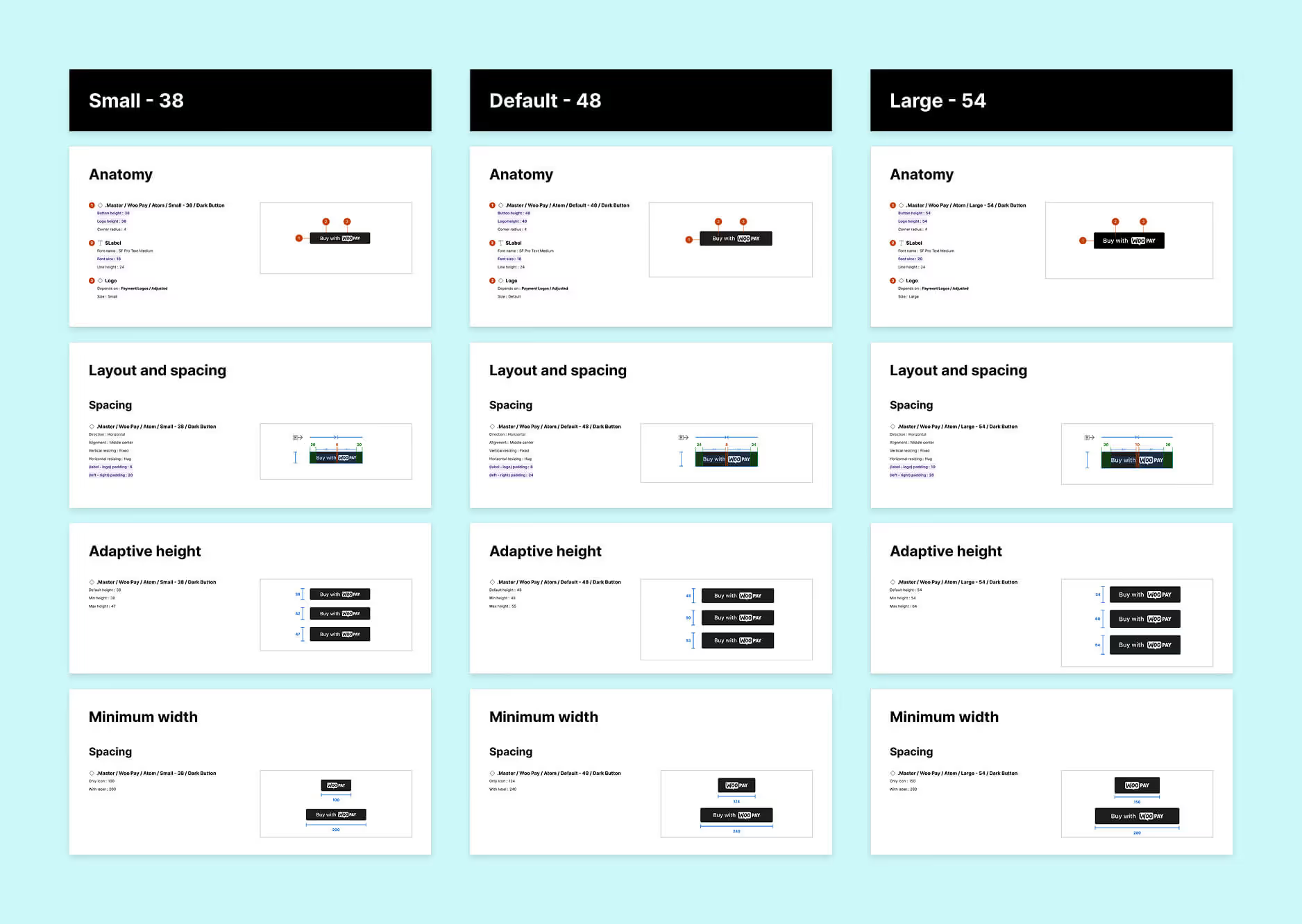
Button UI Specifications
Based on competitive analysis, I examine button UI specifications across three sizes (small, default, and large). To improve visibility, I adjusted the default button height to 48px and proposed adaptive sizing to accommodate variations across different store themes and third-party payment requirements.


Button UI Styles
To ensure visibility and consistency across diverse store themes, I proposed a set of button styles-including dark, light, and light with outline, along with two shape options: rectangular and pill-shaped. These variations offer design flexibility while maintaining a cohesive and trustworthy payment experience.
Impacts
By redesigning payment settings and standardizing button appearance across themes, along with introducing customization tool for layout, size, and branding. WooCommerce now offers a more intuitive and consistent payment experience. These improvements led to 54% reduction in merchant churn related to disabling third-party payment methods.

